
Not another real estate agent
Brand Identity
Strategy
Copywriting
Bespoke Typography
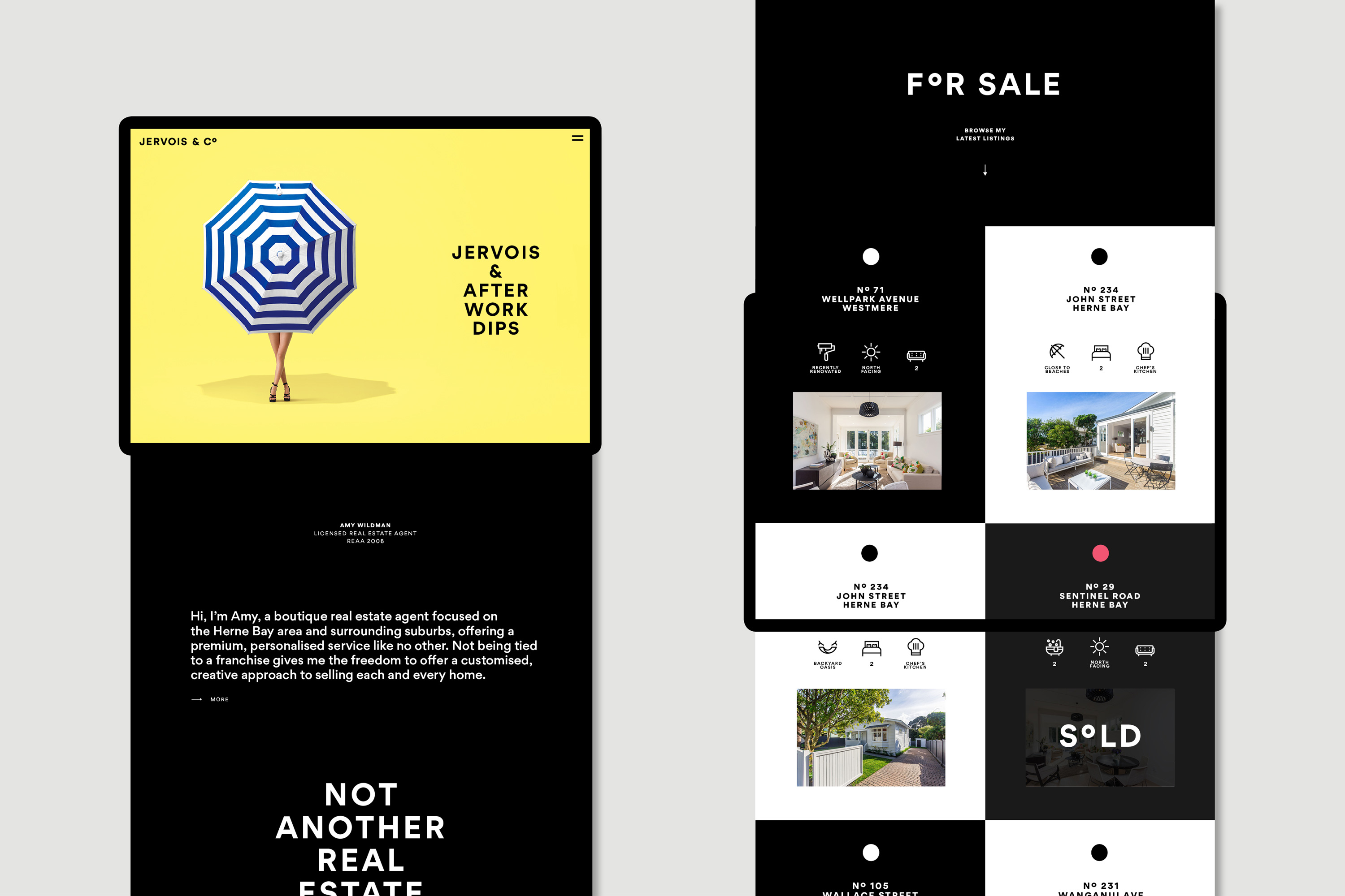
Website Design & Development
Campaign & Advertising
Art Direction
Product Design
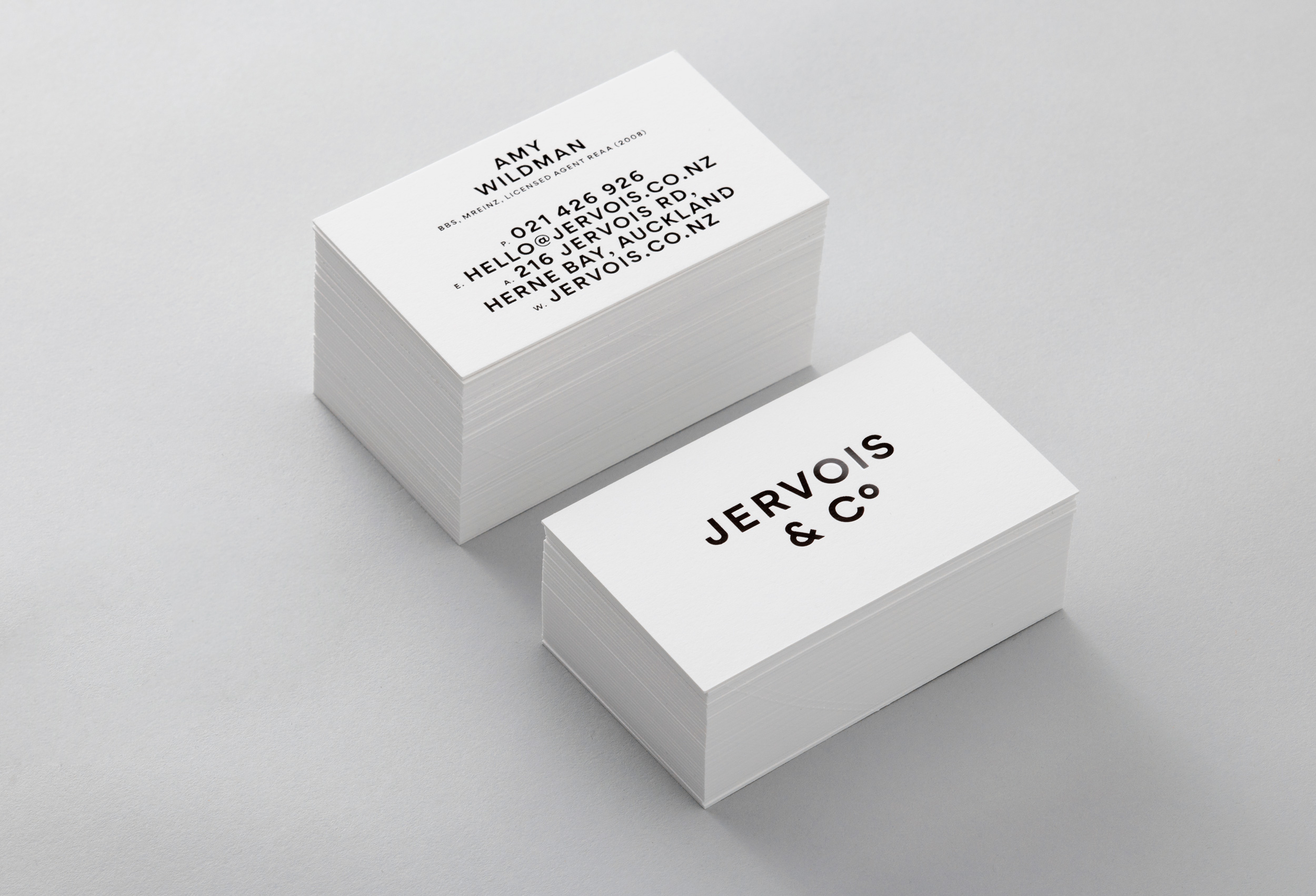
Printed Collateral
Jervois & Co approached us to create a disruptive brand in Auckland's real estate market. In a sector known for its dumbed-down cookie-cutter marketing, Jervois and Co offers a refreshing antidote; a new school, modern approach based on honesty, integrity, tailored marketing, and a ‘charge less, do more’ ethos.
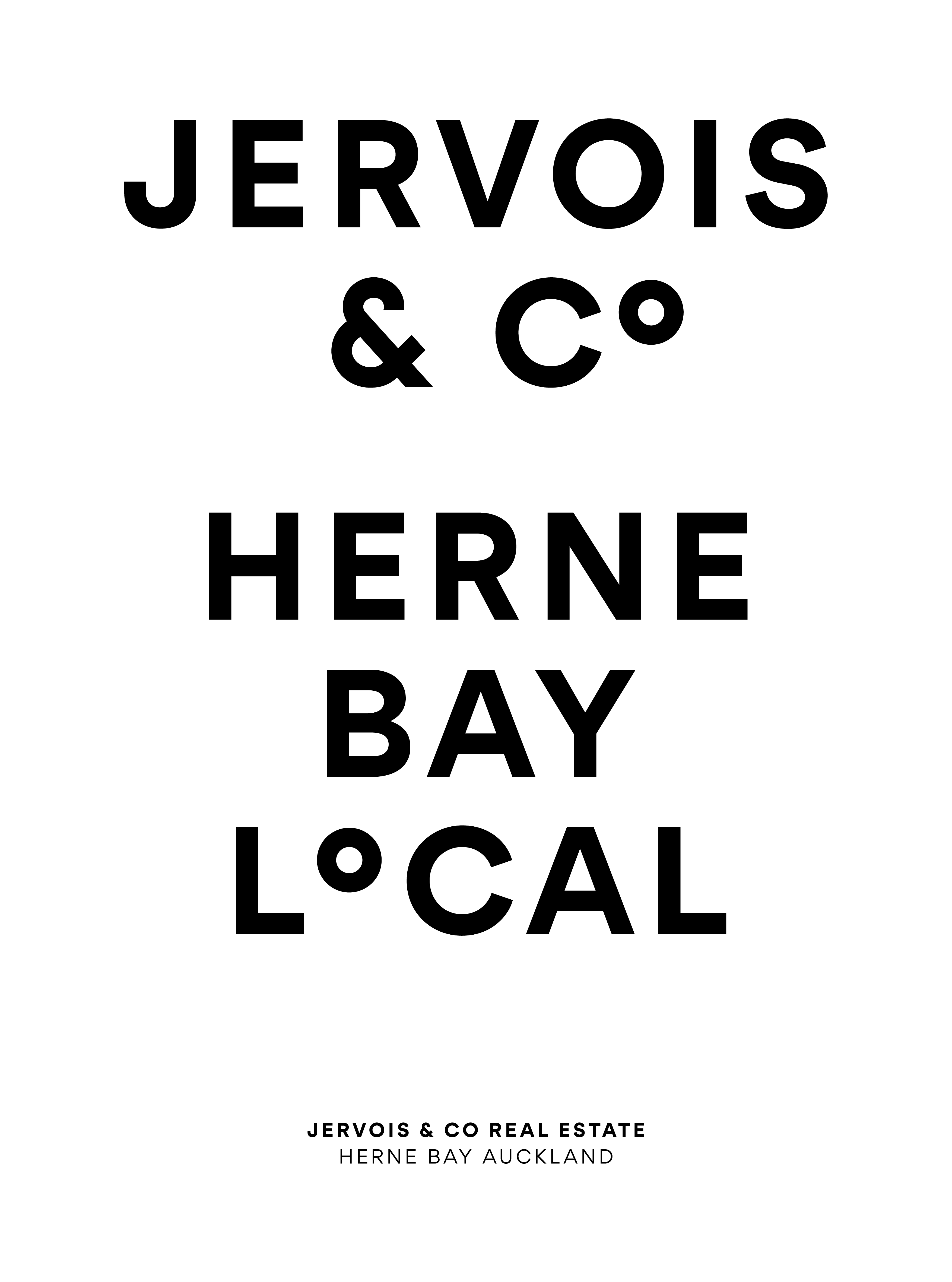
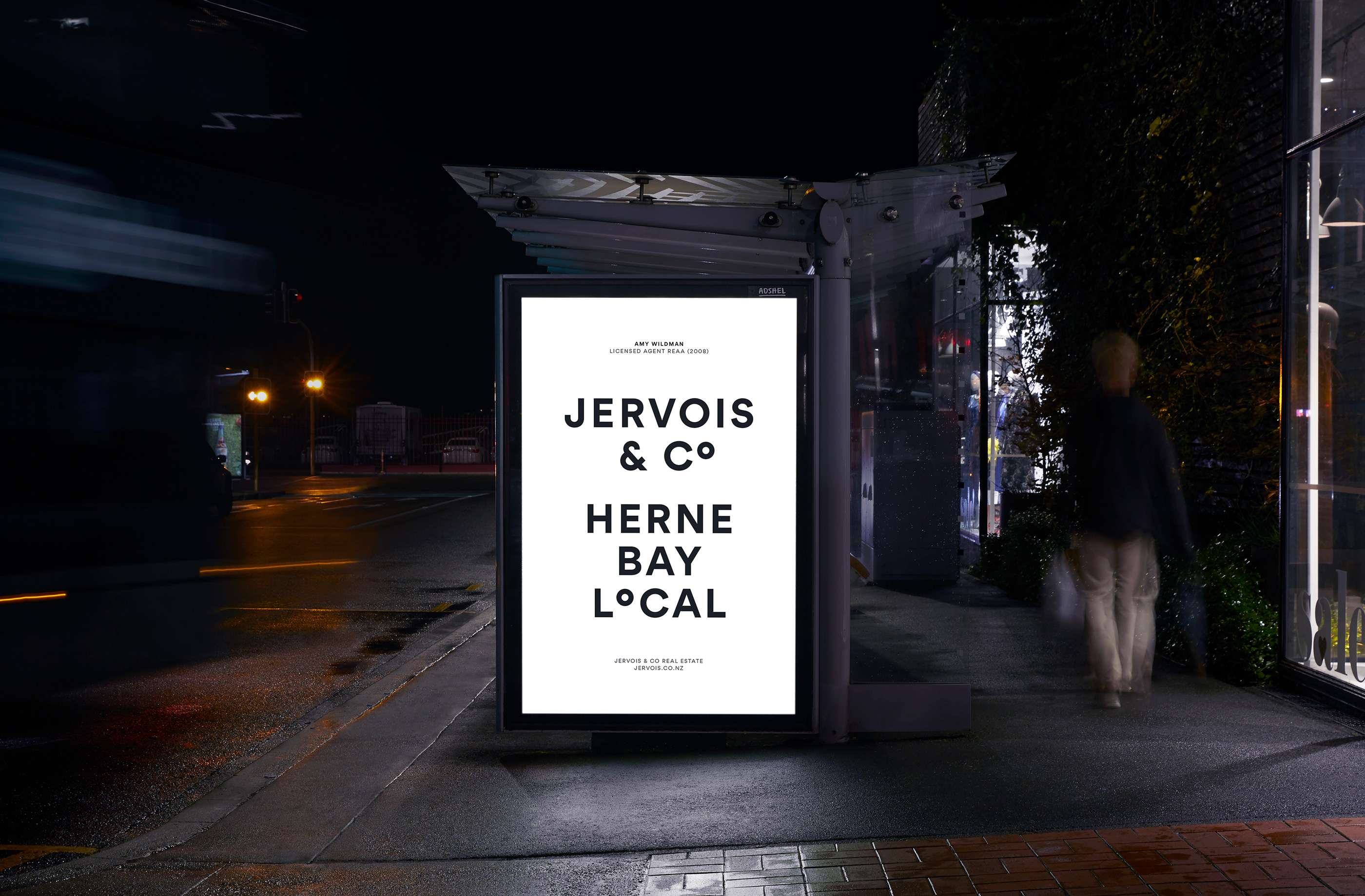
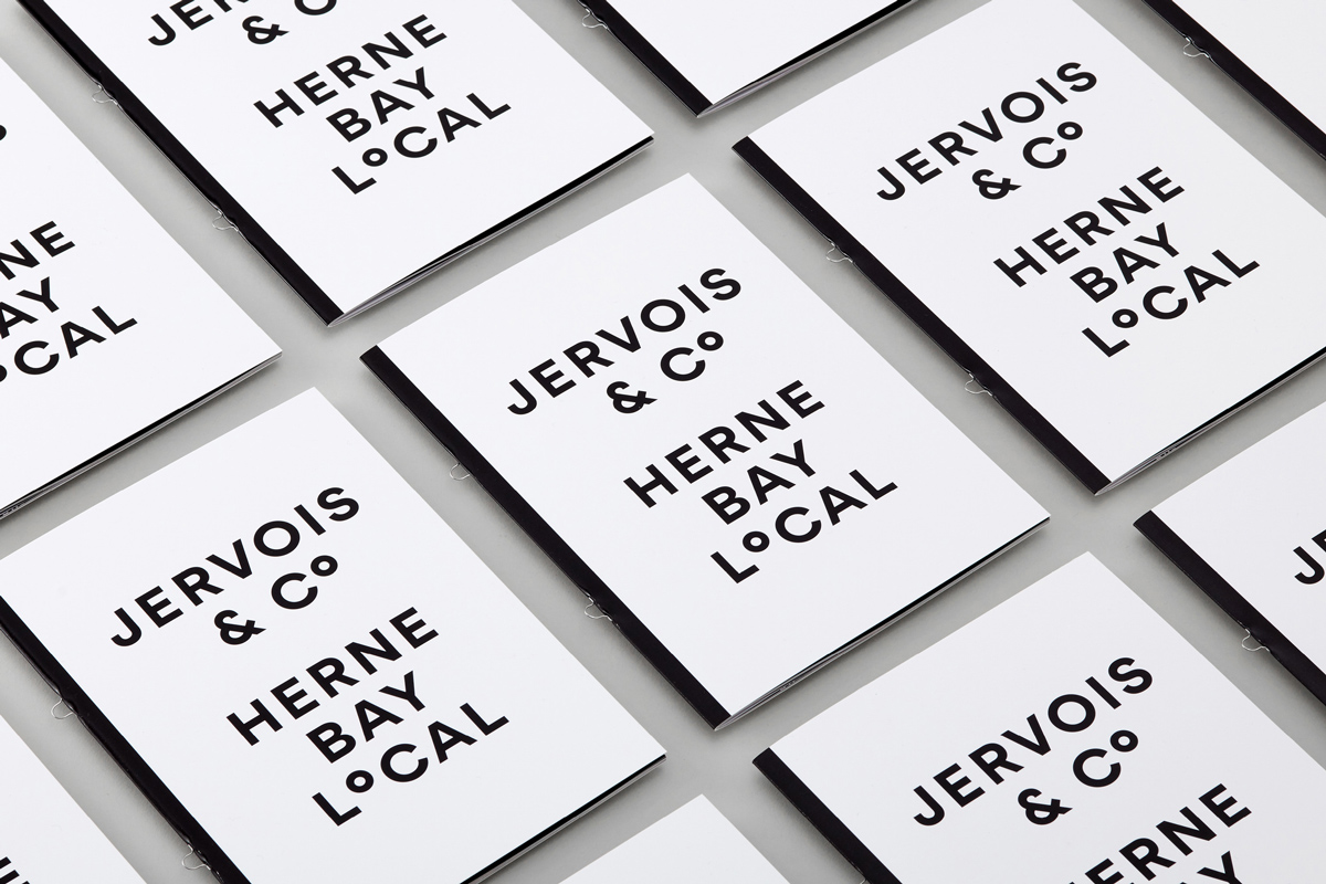
Focussing solely on Herne Bay, Auckland's most affluent suburb, we created a bold identity that's more fashion than real estate.
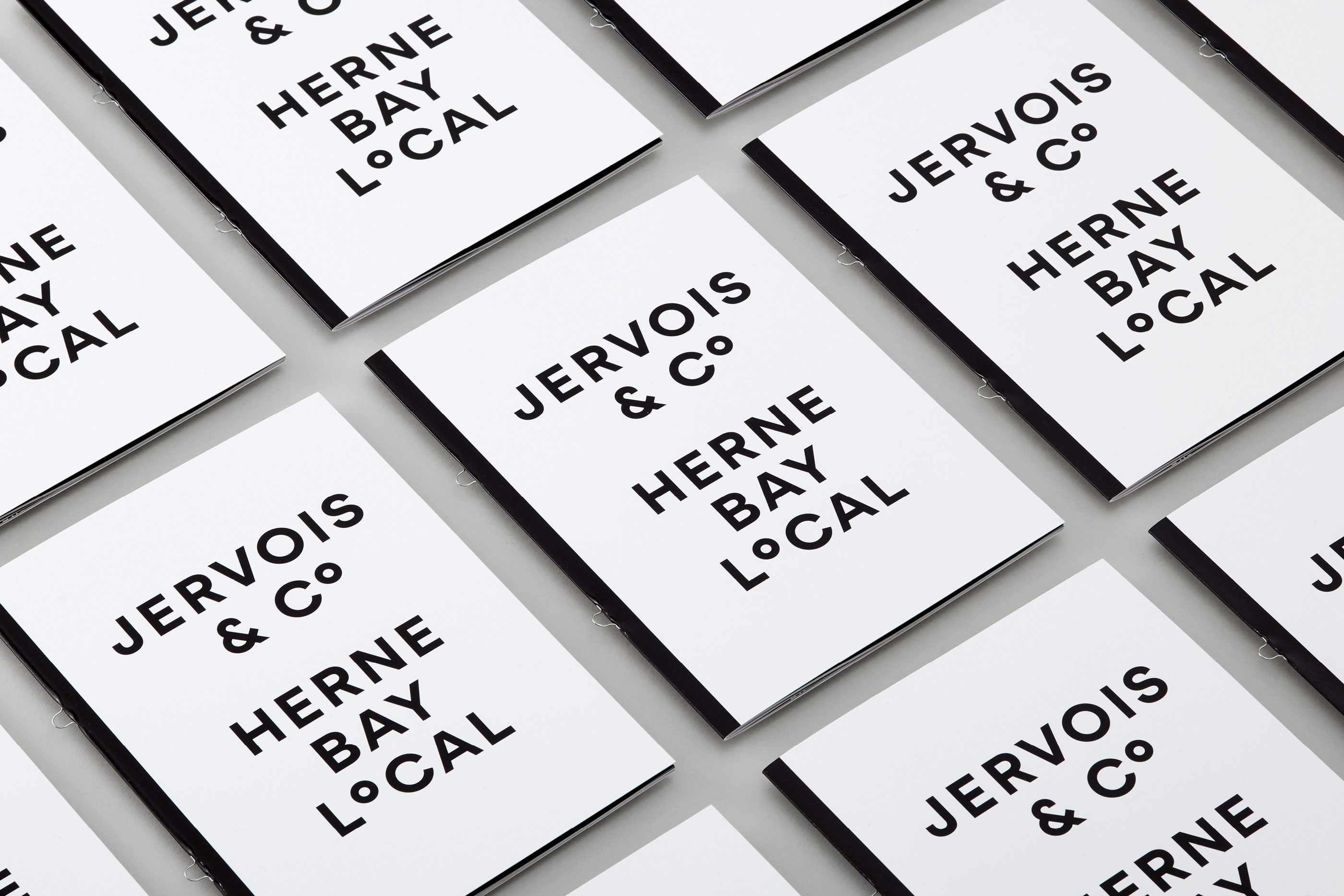
The logo adopts a superscript 'o'; the degrees symbol used to denote a geographic location. The ‘o’ is then taken through to tag various words and phrases for an instantly recognisable point of difference.
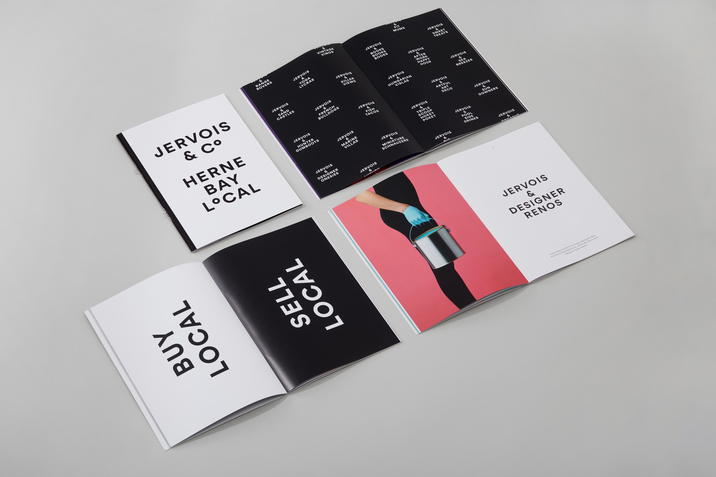
To further set Jervois & Co apart from the competition, we created a set of fashion-inspired campaign images with a twist. These impactful attention-grabbing images sell the aspirational benefits of living in the area.
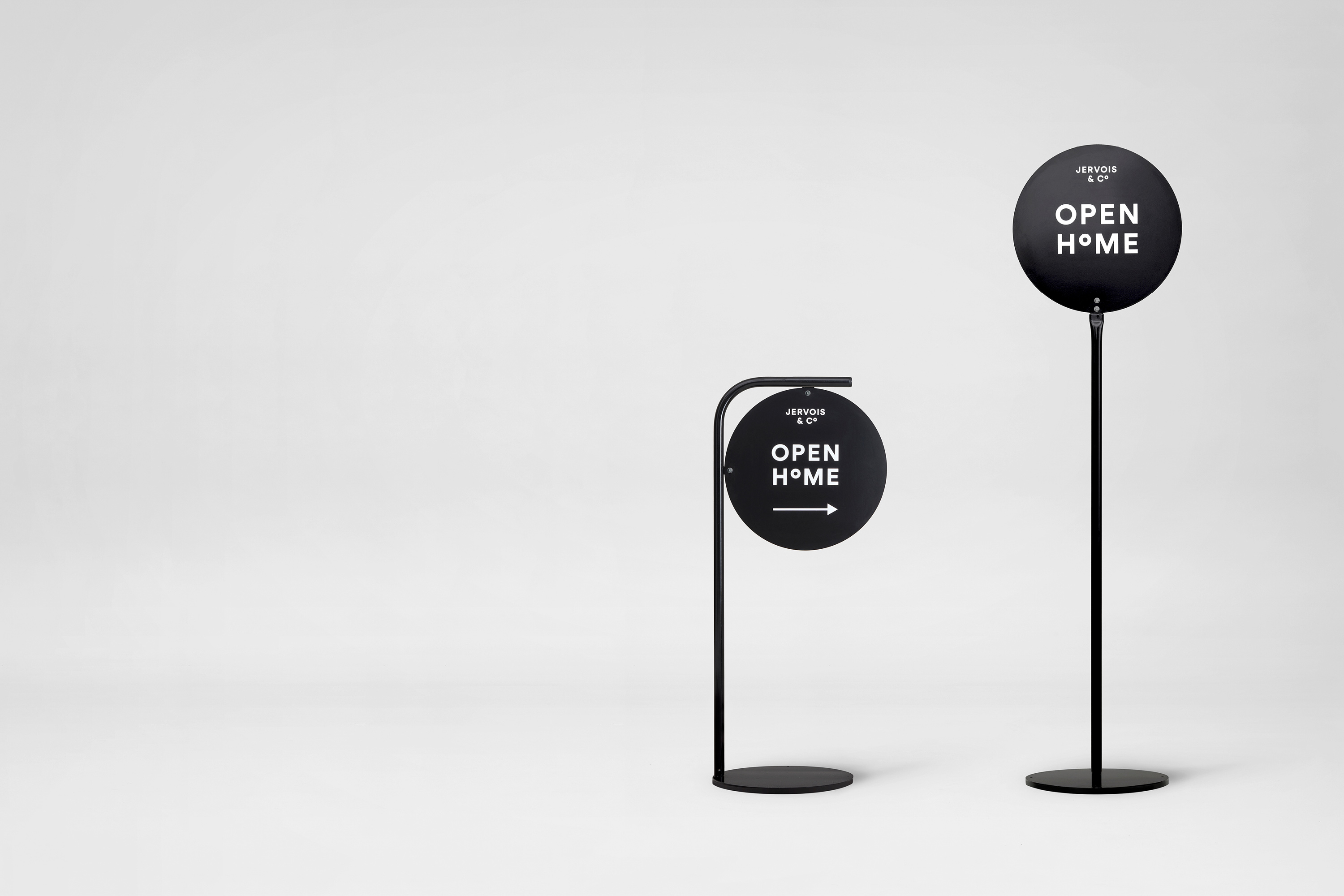
We saw every touchpoint as an opportunity to do something fresh and unique for the sector, such as bespoke powder-coated steel Open Home signs which provide stark contrast to the usual cheap corflute signs.
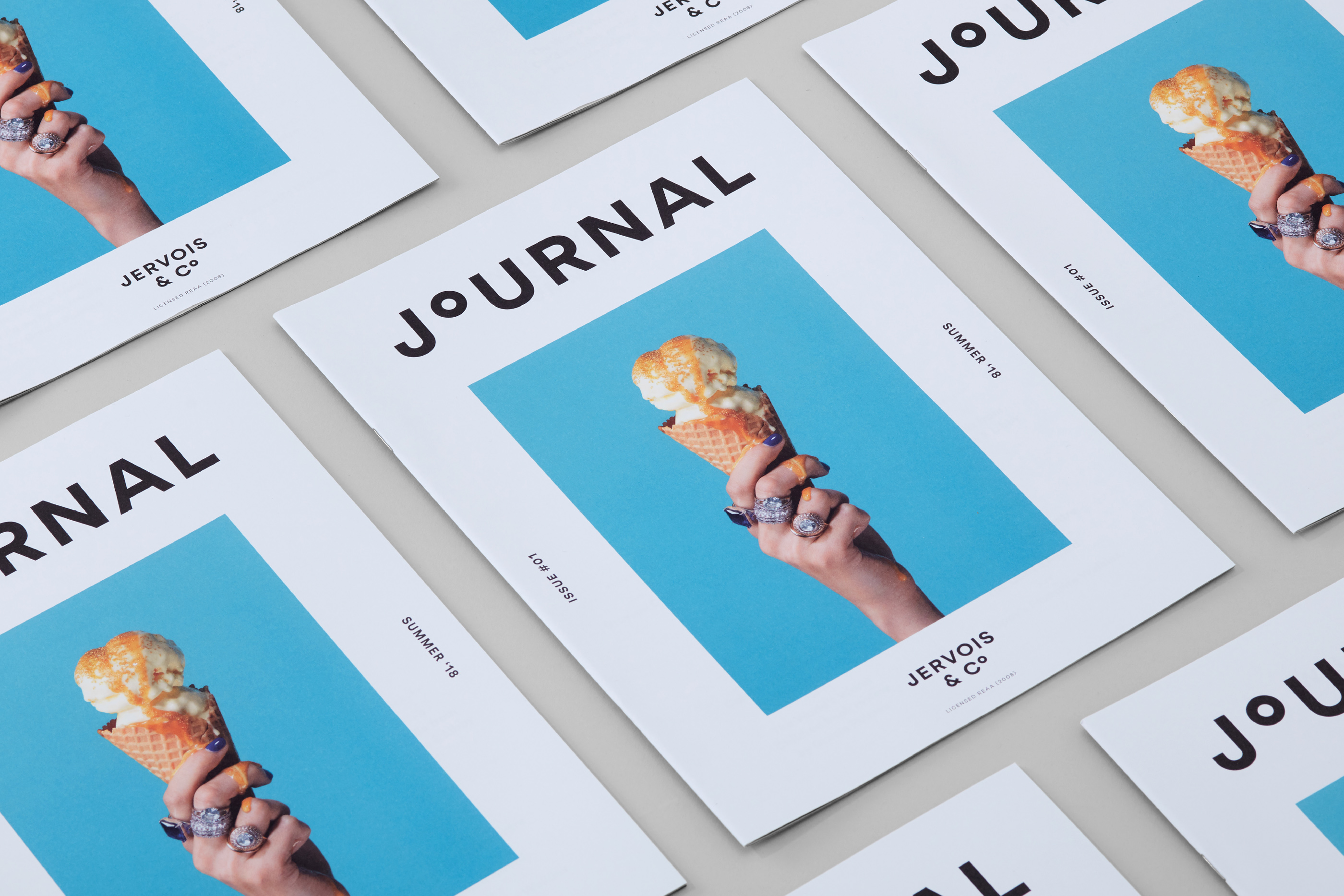
As a strategy to engage the local neighbourhood, we created the Jervois Journal; a seasonal newspaper that celebrates the area and it's occupants.
Brand Identity
Strategy
Copywriting
Bespoke Typography
Website Design & Development
Campaign & Advertising
Art Direction
Product Design
Printed Collateral


Fashion Communication Agency